Fabro Pasta

Branding · Identity · Packaging

A complete identity for a Copenhagen pasta restaurant — hand-drawn logo, a three-color system rooted in the craft, and every touchpoint from packaging to menus to the website.
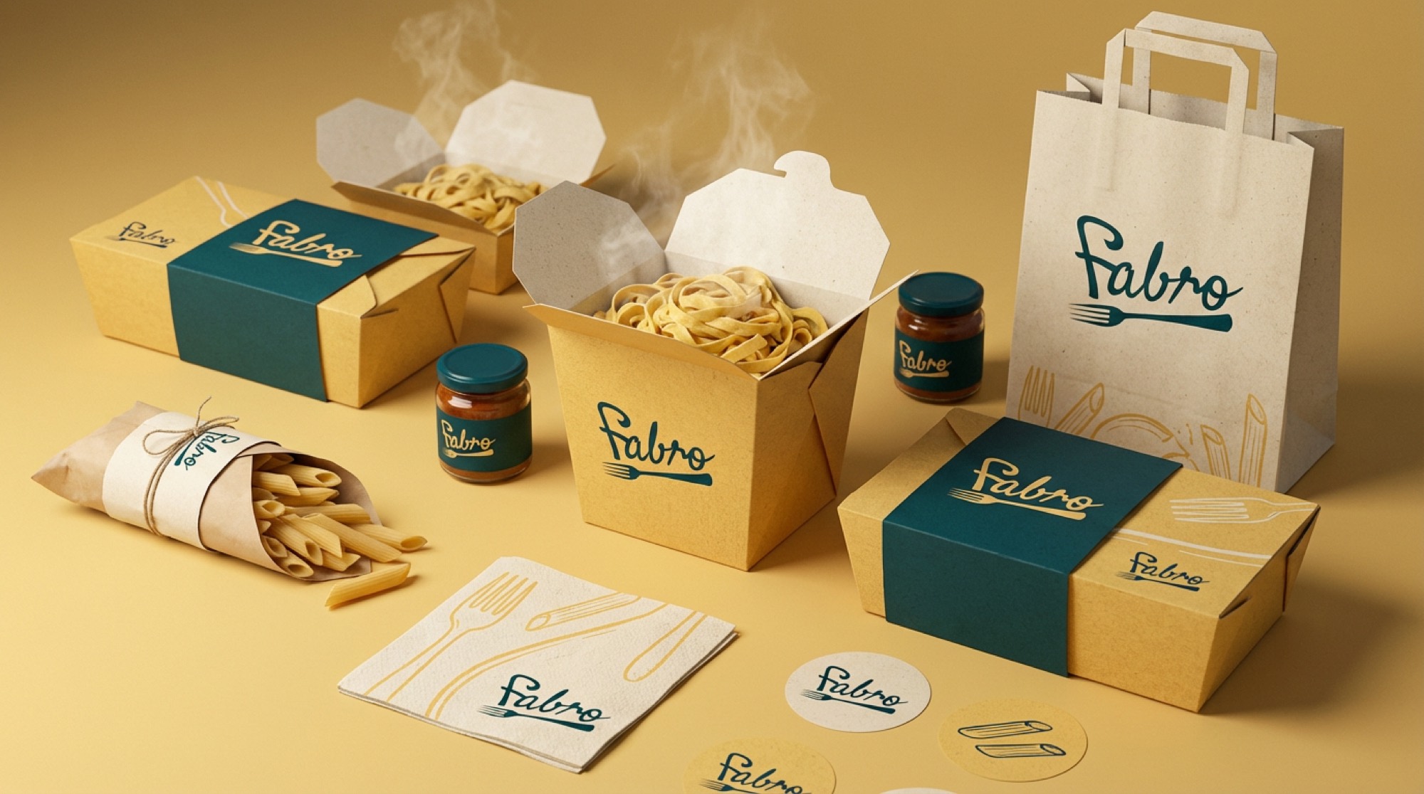
Fabro Pasta packaging — boxes, bags and sauce jars in the brand teal and gold

Sector

Restaurant

Engagement

Full identity

Background

Fabro Pasta is a cozy Italian restaurant in the heart of Copenhagen. It opened with good food and no visual system — nothing tying the room, the takeaway and the menu together.

Our role

We delivered the complete brand identity and digital presence: hand-drawn script logo, minimalist fork icon, color and type system, packaging, menus, branded materials and the website.

Result

Three colors carry the brand — Deep Forest Teal for depth, Golden Semolina Yellow from fresh egg pasta, Parchment Cream for handmade craft — balancing artisanal warmth with Scandinavian restraint.

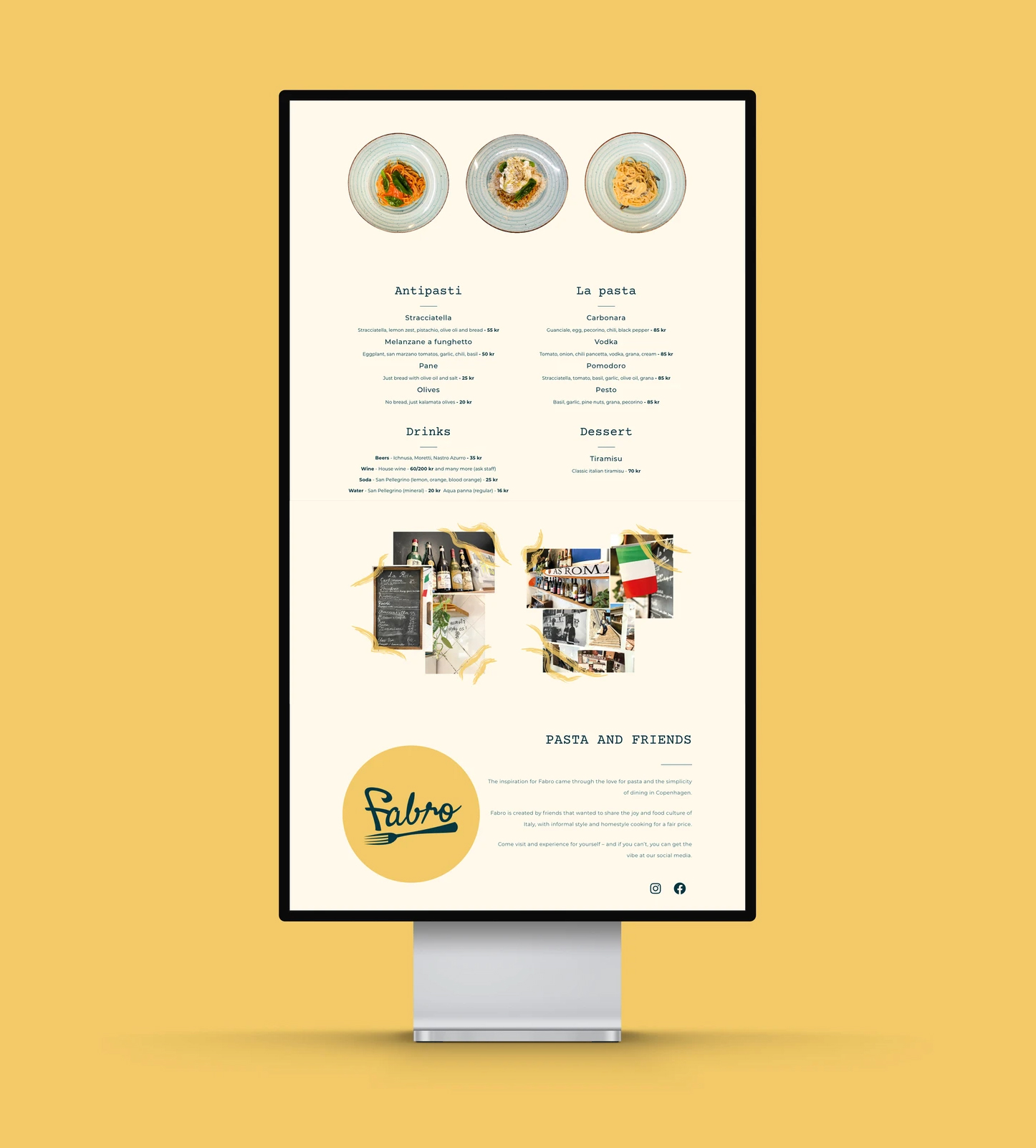
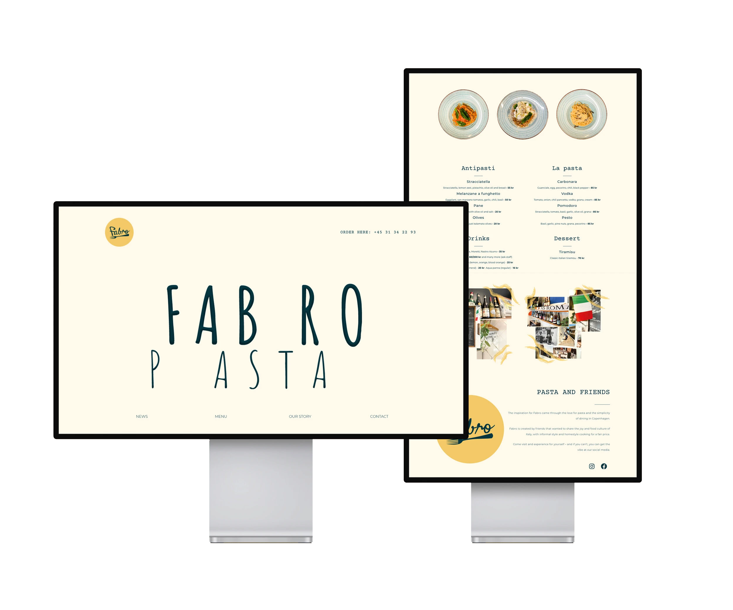
Fabro Pasta website mockup — homepage and menu
The Fabro Pasta script logo on the brand gold
The Fabro Pasta website menu page
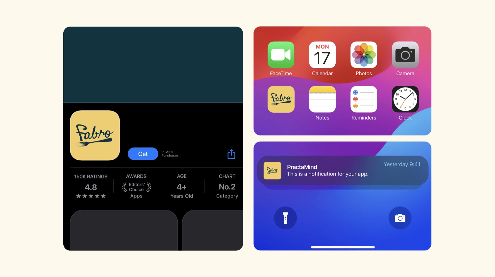
The Fabro app icon on the App Store listing, a home screen and a notification
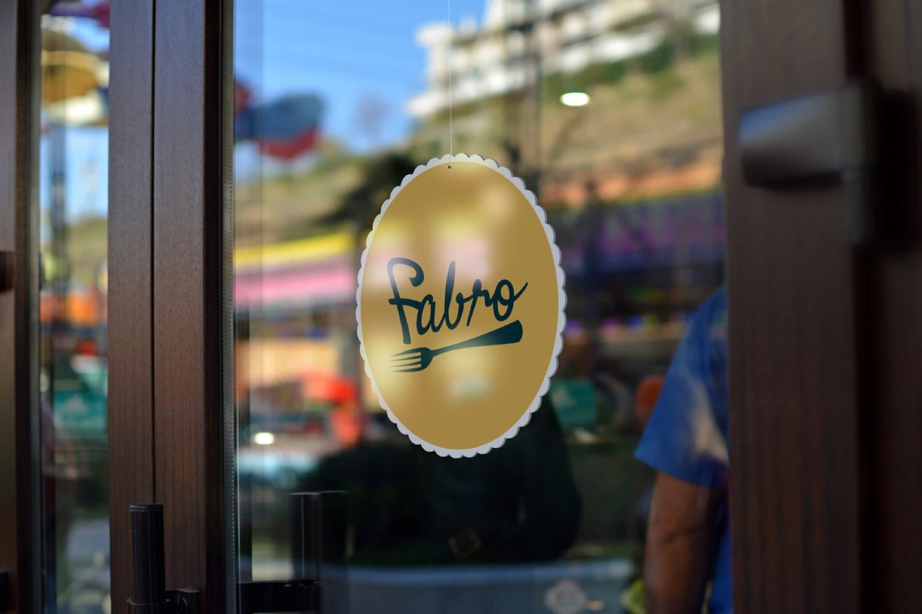
The Fabro logo as a window decal on the restaurant door
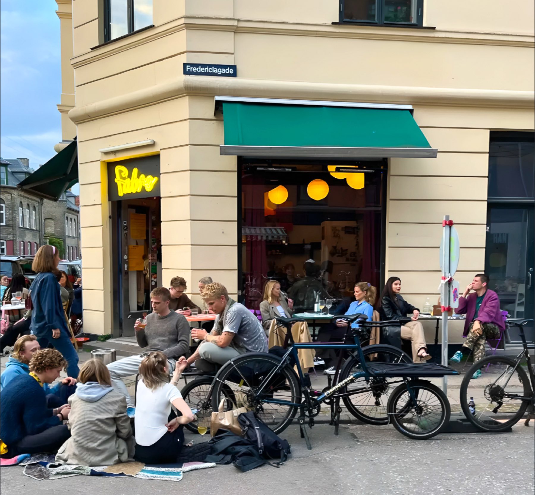
The Fabro Pasta restaurant on Fredericiagade in Copenhagen, guests seated outside

Services delivered

Brand Strategy Visual Identity Logo Design Packaging Design Menu Design Web Design Brand Guidelines
Discuss a similar project