No customer emails you to say they picked someone else because your website looked cheap. They just close the tab. That is what makes a bad website one of the most expensive things a business can own: the loss never shows up as a line in the books.
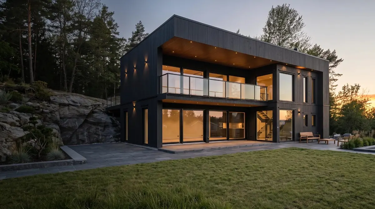
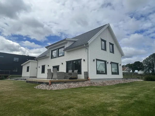
When Brahem i Göteborg got in touch, the problem was easy to describe. The site looked cheap, some buttons didn't work, and it didn't show up on Google. This for a company that builds premium villas, where a single contract is worth more than the entire website.
Here is what we have learned from rebuilding sites like theirs: how to tell whether your own website is costing you customers, a test you can run yourself in ten minutes, and what happened to the numbers when we fixed it.
You Have 50 Milliseconds
Researchers at Carleton University in Canada showed people website screenshots for 50 milliseconds and asked them to rate how appealing they were. The ratings were almost identical to those given after a long look.1 The first impression is set before the visitor has read a single word.
And that impression is about trust. In Stanford's study where 2,684 people judged the credibility of real websites, 46.1 percent of comments were about the site's design look: layout, typography, colour. It was the most common factor, well ahead of the content itself.2
For a small business this means one thing: your website is often the only thing you get to show before the customer decides. If it looks cheaper than what you deliver, the customer assumes what you deliver is cheaper too.
Case Study: Brahem i Göteborg
The starting point. Brahem builds villas, extensions and renovations around Gothenburg, Sweden. The craftsmanship was high end, but the website told a different story. It looked cheap, several buttons led nowhere and it didn't rank on Google. The project photos had been taken on a phone, often in poor light, so finished homes worth millions looked like building sites.
What we did. We started with positioning: from builder to premium villa specialist. Then:
- One message. We wrote all the copy around one idea, "We build homes that stand for generations", and one promise: one company, one contract, one responsibility.
- Photos that do the homes justice. We enhanced the phone photos, balancing exposure, white balance and colour. The homes now look the way they do in real life.
- A calm design. Plenty of air, a restrained typeface and the colours from Brahem's existing logo, navy and gold.
- Everything works. One clear path to contact, a form with spam protection that doesn't make visitors solve puzzles, filterable projects and a gallery with shareable links.
- Built to be found. Swedish and English, proper page titles, structured data and fast pages.
Even Our Own Build Had a Flaw
For this article we measured brahemigoteborg.se with Google Lighthouse. Desktop scored 94 out of 100 and SEO 100. Mobile scored just 59. The homepage headline faded in word by word, and that animation meant Google counted the page as loaded only after 13 seconds. Images were also being sent to phones at full size.
We fixed both without changing the design and measured again:
| Mobile, Lighthouse | Before | After |
|---|---|---|
| Performance (out of 100) | 59 | 79 |
| Main content visible (LCP) | 13.1 s | 4.6 s |
| First content visible (FCP) | 4.1 s | 1.8 s |
| Page weight | 2.3 MB | 0.5 MB |
| SEO / Accessibility | 100 / 95 | 100 / 95 |
The page is now 78 percent lighter and shows its content almost three times faster on mobile. The point isn't that we made a mistake. The point is that a site can look perfect on a desktop and still be slow for the customer on their phone, and you will never notice unless you test. That is exactly why the test further down exists.
Case Study: Zipforce, Sales Up 15 to 20 Percent
Zipforce makes a portable electric motor that turns a regular bike into an e-bike in seconds. The product was clever, but the brand wasn't keeping up. Logo, photography, web store and app didn't speak with one voice, and the product images weren't at the level of the product.
We ran a visual relaunch: new logo, a minimal Shopify store built to convert, a redesigned app and new product photography. Since the relaunch, sales are up around 15 to 20 percent.
"Before we brought in Igor as our Creative Lead, we burned huge sums on external agencies that never really understood our vision. With Igor, everything runs so much smoother. A short meeting about direction, and he gets going."
Aleksa Stefanovic, Partner, Zipforce (translated from Swedish)
The product was the same before and after. The only thing that changed was how it was presented.
7 Signs Your Website Is Costing You Customers
These are the patterns we see most often when we review business websites:
- You hesitate to send the link. If you'd rather send a PDF, or say "don't look at the website, it's old", you already have your answer.
- The site looks cheaper than what you sell. Premium services on a site that looks like a template make customers expect a lower price.
- Buttons and forms don't work. The most common fault we find, and the most needless. Owners rarely test their own site on a phone.
- The photos don't do the job. Dark phone shots, stock photos or no images at all of the work you've actually done.
- Nobody can tell what you do in five seconds. What, for whom and where should be obvious at once, not after three paragraphs.
- There's no clear next step. Either no button at all, or ten buttons competing for attention.
- You don't show up when people search. If customers can't find you on Google or in ChatGPT, the design doesn't matter. Nobody sees it.
The Test: Run It Yourself in 10 Minutes
Pick up your phone, not your laptop. That is where most of your customers meet you first.
- The five-second test (1 min). Show your homepage for five seconds to someone who doesn't know your business. Then ask: what does this company do, for whom and where? If they can't answer, the message is unclear.
- The thumb test (2 min). Try to contact yourself, or buy something, using one thumb. Can you get there in three taps? Does every button along the way work?
- The form test (2 min). Send a real message through your own contact form. Did it arrive? Did you get a confirmation?
- The speed test (2 min). Paste your address into pagespeed.web.dev and look at the mobile result. Under 50 is a problem. The main content (LCP) should ideally appear within 2.5 seconds.
- The search test (2 min). Search for your service plus your city, for example "villa builder Gothenburg", in a private window. Then ask ChatGPT the same thing. Do you show up?
- The mirror test (1 min). Put your website next to your best work. Is the work better looking than the site? Then the site is holding you back.
Why Speed Is Sales
Speed sounds technical, but it is pure economics. According to Google, the probability of a visitor bouncing increases 32 percent as page load time goes from one to three seconds.3 A study Deloitte ran for Google found that a 0.1 second faster mobile site lifted retail conversions by 8.4 percent and average order value by 9.2 percent.4
For Brahem, the time until the main content appeared on mobile went from 13.1 to 4.6 seconds. That's not a tenth of a second. It's eight and a half.
A website that hurts your sales does it quietly. It looks cheap, has a button that doesn't work or doesn't show up at all, and customers move on without telling you why. You can find the faults in ten minutes with a phone and a free tool. Fixing them is often the cheapest way to win more business from the visitors you already have.
Fix or Rebuild?
Fix when the problems are technical and contained: a broken button, heavy images, missing page titles, a form that doesn't send. That can often be done in a few days.
Rebuild when the impression itself is wrong: when the site looks cheaper than your offer, the message is unclear, or every small change becomes expensive. That was the case for both Brahem and Zipforce. No single button could save a site that told the wrong story about the company.
Frequently Asked Questions
The clearest signs are that you hesitate to send the link to a new customer, visitors call to ask things the site should already answer, you don't show up when someone searches for your service and city, buttons or forms don't work on mobile, and the site looks cheaper than what you actually deliver. Run the test above: it takes about 10 minutes.
Aim for the main content to appear within 2.5 seconds on mobile, which is Google's threshold for a good Largest Contentful Paint. According to Google, the probability of a bounce increases 32 percent as load time goes from 1 to 3 seconds.
Fix it if the problems are technical and contained. Rebuild it if the site looks cheaper than your offer, the message is unclear, or the foundation makes every change expensive.
Yes. Visitors form an opinion of a website's visual appeal in 50 milliseconds, and in Stanford's credibility study 46.1 percent of comments were about the design look. At Zipforce, sales rose by around 15 to 20 percent after a visual relaunch.
Sources
- Lindgaard, G., Fernandes, G., Dudek, C. & Brown, J. "Attention web designers: You have 50 milliseconds to make a good first impression!" Behaviour & Information Technology, 25(2), 2006. doi.org
- Fogg, B.J. et al. "How Do People Evaluate a Web Site's Credibility?" Stanford Persuasive Technology Lab and Consumer WebWatch, 2002. consumerreports.org
- Google. "Page load time statistics." Think with Google, 2017. thinkwithgoogle.com
- Deloitte Digital and Google. "Milliseconds Make Millions." 2020. deloitte.com
- Brahem measurements: Lighthouse 12.6, mobile simulation, our own test on October 29, 2026, two runs per mode.